

 Apr 2018


Burly Men at Sea is the kind of tiny narrative toy that insists you slow down and appreciate the sound a beard makes when the wind hits it (metaphorically). Designed by Brooke Condolora and developed by Arkansas-based Brain&Brain, the game first appeared on PC and mobile in 2016 before drifting onto Switch in 2018. What you get is less a traditional game and more a digital pop-up storybook: hand-drawn, low-text, choice-driven vignettes about three round, bearded sailors who bumble through seas populated by creatures from Scandinavian folklore. From a technical perspective the title is deceptive: its minimalism is not a sign of laziness but of deliberate design choices that affect rendering, input, memory footprint, and audio playback in ways that matter on a platform like the Switch. Porting from touch-first platforms (iOS/Android) to Nintendo's hybrid console required mapping tap-driven interactions to buttons and sticks while keeping the cadence of the narrative intact. The rest of this review focuses on how those technical decisions play out - how the game runs, how it handles player input, how the art pipeline scales on Switch hardware, and whether the sound and UI mechanics hold up when you're not swiping with your thumb.
Gameplay in Burly Men at Sea is succinct: you are the storyteller and navigator. Each scene is presented as a static or gently animated illustration with a few tappable hotspots that branch the narrative. Technically the core loop is a node-and-edge state machine - scenes are nodes, choices are edges. That architecture is elegant for several reasons: it minimizes runtime state complexity, it makes save/restore trivial (save the current node ID), and it keeps memory usage predictable because only a small subset of assets need to be resident at any given moment. Because the original design leaned heavily on touch, the Switch port's primary technical challenge is input mapping. The game's interactions are binary and local - you select between two or three options - so the conversion maps comfortably to face buttons and directional inputs with almost no loss of fidelity. Where the experience could suffer is in latency and feedback: on touch platforms you get immediate tactile confirmation from pressing the screen; on the Switch the developers compensate with slightly more pronounced visual feedback, short UI transitions, and satisfying audio cues to replace that missing tactile snap. Under the hood you can infer that assets are organized as composited layers rather than large pre-rendered frames. The art style's flat color regions and clean lines lend themselves to runtime composition, which lowers memory pressure and shortens load times. Scene transitions are typically implemented with alpha fades, parallax pans, and minor sprite translations rather than expensive full-screen effects - a pragmatic choice that keeps GPU and CPU load minimal on Tegra X1-class hardware. The branching structure also affects the save system and replayability: because the narrative graph is finite and relatively shallow, the engine can precompute reachable endings and present a compact achievement or unlock state without runtime brute force. That yields a replay loop that feels rewarding without being punishing; you explore another branch and the engine simply pulls in a small set of assets and continues. This approach is a textbook example of balancing narrative ambition with technical constraints. A couple of UI/UX notes: the text density is low, which reduces font rendering complexity and localization overhead. The game's typography choices - large, high-contrast display fonts - make it resilient to different screen resolutions and viewing distances, important for a console that can be docked to a TV. Controls are simple and consistent, and the small command set means input buffering and debounce logic are basic but effective. Performance is uniformly stable in my experience. The game's frame workload is dominated by 2D compositing and a handful of skeletal or sprite animations; there's no physics simulation or particle frenzy. That pays off on the Switch: CPU spikes are rare and GPU work is compact, so battery life in handheld mode trends better than heavier indies and the game is quick to load between scenes.
Visually Burly Men at Sea is engineered around a restrained, illustrative aesthetic. From a technical standpoint the art pipeline looks like it favors hand-drawn vector or raster assets exported at multiple scales, then composited at runtime. That gives the game its storybook look while avoiding aliasing or pixelation when the resolution changes. On Switch the line work remains crisp whether you're holding the console or playing on a TV - the developers made sensible choices about anti-aliasing and texture filtering that prevent jagged edges on the signature black outlines. Color and palette are crucial here. The limited palette minimizes the need for complex shading or expensive overdraw; most depth is suggested by contrast and layering rather than by heavy lighting calculations. This is a performance win: you get an attractive scene with low fill-rate cost. Animations are economical - small loops, head turns, and parallax layers - which reduces the need for large sprite atlases or high-bandwidth animations. The result is a low memory footprint and fast scene swapping. One technical caveat relates to resolutions and scaling. The Switch is a hybrid console with two primary render targets: a smaller handheld display and a larger TV output. The game's UI and art scale comfortably across both because assets are created with generous margins and typography that doesn't rely on pixel-perfect placement. However, players with very large TVs may notice the artwork's intentional simplicity; any attempt to inspect detail beyond the intended frame reveals the limits of the minimalist design. This is a design choice rather than a porting flaw - it's a book, not a painting you hang in a gallery. Audio is treated with similar economy. The soundtrack is playful and loop-based, and the sound engine seems to prioritize seamless loops with gentle crossfades rather than heavy DSP. That yields consistent background music without abrupt cuts between scenes, and it keeps CPU overhead trivial. Voice is absent, which simplifies asset size and localization, while the short effect samples for interaction clicks and ambient sounds are judiciously used to provide feedback without cluttering the sonic space.
Burly Men at Sea on Switch is a tidy technical package that matches its aesthetic and mechanical ambitions. The port avoids the common pitfalls of mobile-to-console conversions by mapping touch-first interactions to button and stick inputs while preserving responsiveness and narrative rhythm. The underlying architecture - node-based scenes, composited layered art, light-weight animation loops, and economical audio - makes the game a low-demand, high-charm experience on Nintendo's hardware. If you're evaluating the Switch version on purely technical criteria, it checks the boxes: stable performance, short load times, UI scaling that survives both handheld and docked modes, and an art pipeline that keeps memory and GPU needs modest. The game's limitations are intentional: the minimalist art and short vignettes are part of the experience, not bugs. That means the review score reflects not only competence in engineering but also a clear alignment between design intent and technical implementation. For anyone who likes branching stories, tactile simplicity, and an experience that behaves like an interactive picture book rather than a systems-heavy blockbuster, Burly Men at Sea is a polished and well-executed title on Switch. It won't break your console, it won't make you memorize button combos, and it will probably make you smile at the sight of a particularly burly beard. Pick it up if you want a relaxed, technically clean narrative diversion - one that treats constraints like a design material instead of an obstacle.
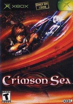 Sea Monsters: A Prehistoric Adventure on DS
 PlayStation Plus August Drop: Mortal Kombat 1, Spider-Man, Sword of the Sea and Two Resident Evils — Sony’s Buffet of Beatdowns and Beachside Introspection
 Tintin: Destination Adventure on PlayStation
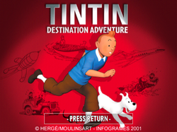 One Piece Grand Adventure on PS2
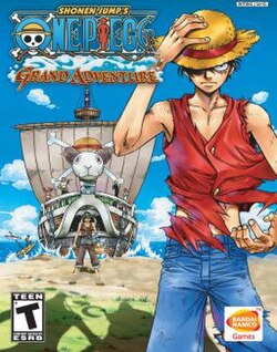 Taiko no Tatsujin: Dokodon! Mystery Adventure on Switch
 Taiko no Tatsujin: Don to Katsu no Jikū Daibōken on Switch







 Another SquareThought Site